Case study
MailMetroMedia Creative Showcase
Timeframe:

September-January 2016

Tools:

Sketch, Invision, Slack, Trello, Adobe CC, Optimal Workshop, Usertesting, Google Analytics, Hotjar.

My role:

I led the design process from research to final implementation. I collaborated closely with the Project Manager, Head of Creative, Ad Operations Manager, Sales Director, and Account Managers. My responsibilities included user research, competitive analysis, data gathering and organisation, concept development, usability testing, UI design and development handoff.

TL;DR:

The MailMetroMedia Showcase was developed as a portfolio for MailMetroMedia’s Creative Team to centralise and streamline access to ad format specifications and examples. It served as a user-friendly, efficient platform for advertisers and media agencies to explore the wide variety of available ad formats. The platform reduced inefficiencies, enhanced client satisfaction, and strengthened internal collaboration.

Increased Efficiency:

reduced the time spent searching for and sharing ad specifications

Enhanced Client Satisfaction:

higher client retention rates

Improved Ad Data Management:

reducing miscommunication

Streamlined Collaboration:

improving overall project workflow

Design Process

⬇️Jump directly to these sections:

1. Discover phase: Understanding the business and the context

I began the project with a deep-dive into user research and understanding the business needs. I collaborated with various stakeholders—sales teams, ad operations, and clients—to uncover pain points and understand the core problems.

The context

MailOnline has a very large and diverse offering of digital display and native digital products. There are about 40 different digital ad formats ranging between desktop, tablet, mobile, across web and apps. Not to mention all the new formats currently in development. Part of the projects that are sold to clients are designed and built in-house by the MailMetroMedia Creative team. However, a lot of the time, clients, media agencies and their creative agencies prefer to build things themselves following the ad specifications provided by the team.

The problem

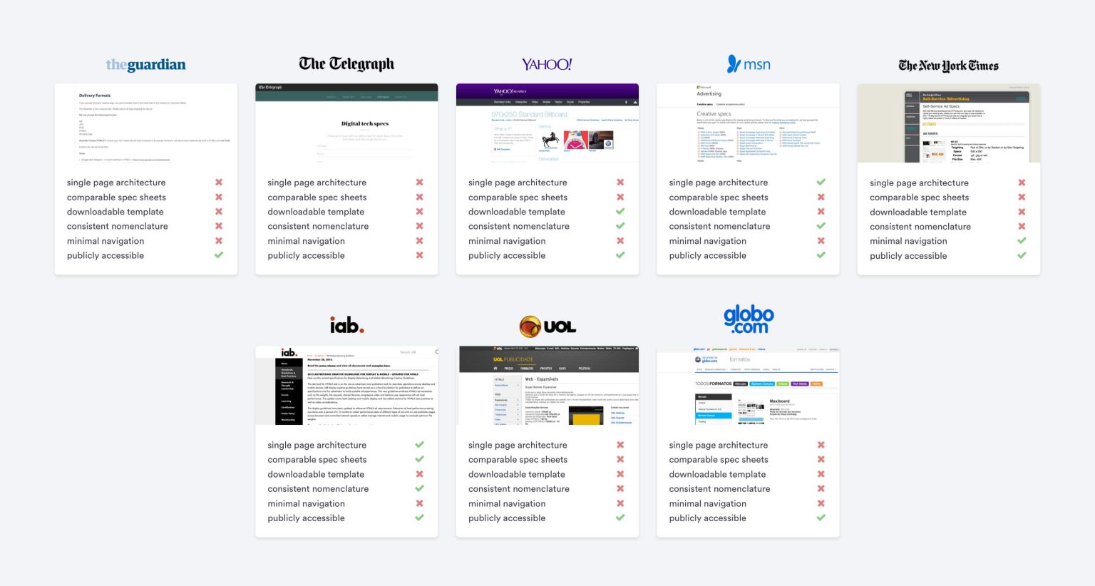
The MailOnline Creative Showcase lacked a centralised, user-friendly platform to access detailed ad format specifications and past campaign examples. This led to disorganisation, outdated information, and miscommunication between internal teams, clients, and media agencies. As a result, clients frequently received incorrect ad specs, which caused frustration, delayed campaigns, and ultimately reduced client satisfaction and retention.

The objective

MailMetroMedia needs a portfolio to showcase what the Creative Digital Team produce so that potential new advertisers can have a better understanding of what they would be buying into in terms of execution.

User research

We conducted interviews and collected qualitative insights from internal teams and external clients (creative agencies and advertisers). This helped identify the frustrations.
Key takeways:
  • Scattered, oudated specs in various formats(spreadsheets, presentations, PDFs).
  • Difficulty accessing correct, up-to-date information.
  • Miscommunication with clients due to wrong specs.

User personas

I started this project by analysing what types of users we were trying to communicate with. The primary users being creative/agency types and therefore familiar with the technical ins and outs of ad serving platforms and rich media, it was safe to assume the information should be easily accessible and using technical terms wouldn’t necessarily get in the way. Non tech savvy users also had to be catered for however, so clearly stating format names as recommended by the IAB was a great way to make sure they knew exactly where they were.

The rest of the team and I created a few proto-personas that we would often come back to during the development of this tool. We found having these proto-personas was a great way to remove ourselves and our own biases and ideas from the process, allowing us to approach it more objectively and with the end users in mind.
The main users of the site would include MailOnline’s own sales team, brands, media and creative agencies working for their digital clients, each having their own unique set of goals. The internal sales team would be after simple specifications: where formats sit on the MailOnline page, their dimensions and where these formats are available on the site. They’d also constantly have to show clients what formats they had sold in, this is why the site creates unique persistent URLs for each format.
Key takeways:
  • Sales teams: Quick access to specs for pitches.
  • Media agencies: Ability to compare and analyse ad formats.
  • Creative teams: Technical details for ad builds.

Competitive Analysis

Looking at what other similar sites did to organise their data, I noticed most of them seemed to have trouble classifying information in a way that made it easy for the user to compare between different formats – ie. not all formats used the same fields, even naming conventions and some of those websites weren’t even public, forcing you to request access and wait for a response.
I worked with a Project Manager, the Head of Creative, the Ad Operations Manager, the Sales Director, one of our Account Managers and a few of his clients to run some basic research, competitive analysis, set design goals in response to this fundamental need of the business.
During the Define phase I conducted workshopt with internal teams, including sales and ad operations, to further refine the ideas. Through methods like brainstorming we translated the UX research insights gathered during the Discover phase into actionable design solutions. These sessions helped refine the filtering options, optimise the overall organisation of the ad formats, and identify any gaps in the data that needed to be addressed before starting to define the platform information architecture.

Data gatering

I collaborated with Ad operations to collect and organise over 40 ad formats across devices (desktop, tablet, mobile). This data was messy, with multiple sources, so I spent significant time standardising and normalising it. Once collected, this data was then used to generate the downloadable packages that also included build guides, Photoshop templates and printable versions of the spec sheets.

Data sort

I sorted all the data into categories and normalised them into the same spec sheet so they could be easily compared and clients could get a better understanding of what they were buying into.
Now I had a good grasp of what we were trying to accomplish, I then started sketching out ideas and coming up with ways to navigate and represent this data structure. My concept involves arranging images of  past campaigns in tiles and providing users with complete control over what they see through a filtering system. The challenge was to make the content accessible to navigate regardless of the variety of categories of information available. I came up with two different options for the navigation component. I created interactive prototypes and conducted moderated usability testing with internal sales teams and external clients.  

Usablity testing questions

Wireframes

OPTION1:  Since the user would be able to use several types of filters – channel, format, device, category – my main concern was in keeping navigation simple instead of overwhelming the user with options. Additionally, the switch toggle OFF button provides a quick way to disable all active filters.

After analysing feedback on the first usability testing, I refined Option 2 into a two-panel layout with a filtering panel and a content display area, ensuring a smoother navigation experience.

OPTION 2: To simplify navigation, I created a list of dropdown menus for the filters, allowing users to select multiple options and chain them together to expand their search. To prevent overwhelming users with options, my main concern was keeping navigation simple. The initial state option provides a quick way to disable all active filters.

Key takeaways
Option 2 received much more positive feedback, mostly due to the fact it requires fewer interactions in order to access the content.
  • Feedback on Option 1: Users found the dropdown filters overwhelming, with too many clicks required to get results.
  • Feedback on Option 2: Preferred for its simplicity and fewer interactions, which made navigation faster and more intuitive.

UI Design: I designed a clean, intuitive interface that visually prioritised important information—format names, specs, and visual examples. The design allowed users to filter ad formats by platform (desktop, mobile, tablet), category, or type, enabling fast comparison.

Accessibility: Implemented best practices for accessibility (WCAG compliance) aiming for WCAG 2.1 Level AA compliance standard to ensure that the majority of users with disabilities can access and interact with the platform effectively.

5. Project Outcome:

Increased Efficiency:

reduced the time spent searching for and sharing ad specifications

Improved Ad Data Management:

reducing miscommunication

Enhanced Client Satisfaction:

higher client retention rates

Streamlined Collaboration:

improving overall project workflow

Increased Efficiency:

Better communication and collaboration within the business. The time spent searching for and sharing ad specifications decreased dramatically, boosting team productivity.

Improved Ad Data Management:

The centralised platform increased productivity by streamlining access to ad specifications and examples, reducing the likelihood of errors and miscommunications.

Enhanced Client Satisfaction and Retention:

Clarity and accuracy of information improved relationships with clients, leading to repeat business and higher retention rates.

Streamlined Collaboration:

Internal teams worked more cohesively, and external clients experienced fewer frustrations with outdated or incorrect information.

Wanna hear the full version?🎬🍿

Let's schedule a call!

Connect with me on LinkedIn, email me at info@myriammartindigital.com or send a message below.

© 2024 Myriam Martin Digital. All rights reserved.

Top