Case Study
Visit London Design System
Timeframe:
June 2023 – ongoing
Tools:
Figma Token Studio, Github, VSCode, Style Dictionary, Storybook
My role:
UX/UI, Usability Testing, Wireframing, Prototyping, Developer Hand-off, Design System. I worked as the sole designer in a team with one product manager, one back-end developer, and one front-end developer.
TL;DR:
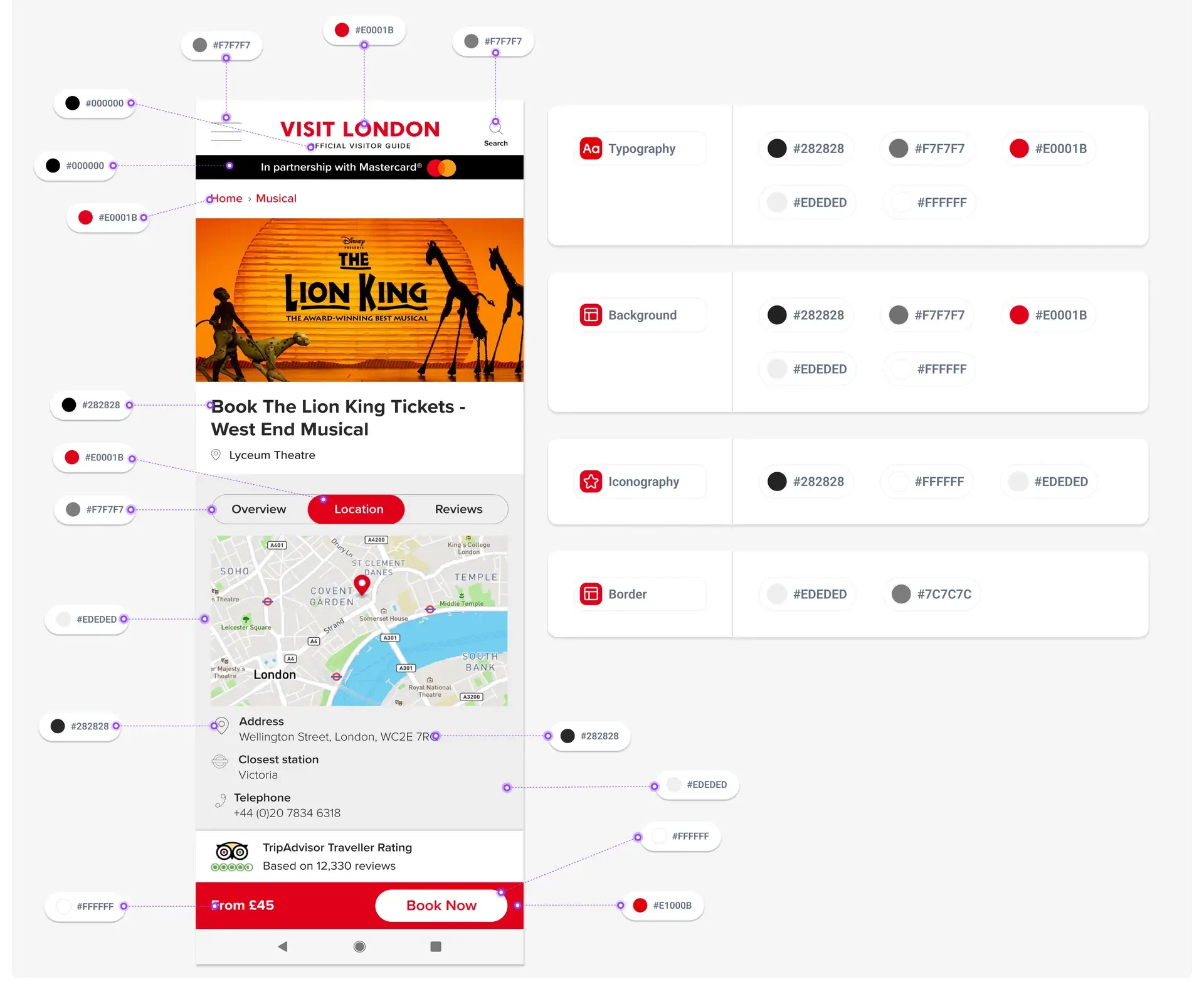
As part of the Visit London platform revamp, we introduced a comprehensive design system to enhance efficiency and streamline development. By leveraging over 525 pre-designed components, the system significantly accelerated our workflow, allowing the team to create and deploy consistent, high-quality elements swiftly. This not only reduced duplication of effort but also optimised the development process, ensuring faster delivery and improved product quality.
The design system also played a crucial role in expanding the adoption of Visit London’s digital products. Its standardised approach facilitated a cohesive user experience across the website, mobile app, newsletter templates and social media channels.
Increasing Efficiency:
Visit London’s Transition
to a Design System
Optimising Development:
Leveraging 525+ Components
Expanding Adoption:
Enhancing Digital Products
Boosting Agility:
Streamlining Visit London’s Workflow
Design System Design Process
⬇️Jump directly to these sections:
📝 Visit London Redesign as a Pilot Project
Integration with the Visit London Website Revamp
Initially, a lack of a design system resulted in a disorganised product, as uncovered by user research and audits.
The Visit London website revamp served as a pilot project for the design system, allowing for real-time testing and feedback. This simultaneous development with this pilot project provided a good foundation for ensuring the design system’s design, components and code were batte-tested.
1. Objectives
- Improved Consistency: Ensure a cohesive look and feel across all Visit London digital touchpoints by standardizing UI components, color schemes, typography, and brand elements.
- Faster Development: Accelerate the development process by providing a library of reusable components and design patterns that developers can easily implement.
- Enhanced User Experience: Improve the overall user experience by creating intuitive, accessible, and visually appealing interfaces that resonate with the Visit London brand.
2. Selling a Design System: UI inventory
One effective strategy for selling a design system is to make everyone feel the pain of inconsistent user interfaces. To do this, I like to conduct a user interface audit of existing assets to evaluate the current design elements, patterns, and components used across your products and identify inconsistencies and areas for improvement.
I gather screenshots of every UI element: visual balance, colour palette inconsistency, typography hierarchy, icons, button styles, input fields, forms, navigation, pagination, breadcrumbs, cards, carousels, checkboxes, modals, etc. I also record the most critical user flows and processes. Typically, I compile all these findings into Figma, annotate them extensively, and play detective, hunting down any visual or functional flaws.
🤯We had 54 fragmented button styles
From a technical standpoint, it’s crucial to emphasise that each of these variations represents significant time, energy, and effort from development, design, and QA teams. When you multiply these efforts across all your products and services, the cost becomes staggering.
The goal is to capture all these variations and properties and create reusable UI components, centralising everything in one place. This approach not only streamlines development but also ensures consistency across all products, saving time, budget, and resources.
3. Plan
Before diving into the creation and maintenance of Visit London Design System, it’s essential to have a clear plan. The Design System Canvas helps consolidate all crucial information, assess the current state by mapping out existing components and their condition, and plan future developments with realistic timeframes. It also serves as a valuable tool for gaining stakeholder buy-in by detailing key activities, objectives, and target users. This alignment ensures that the Design System supports the organization’s overall objectives, keeping everyone on the same page and working towards a common goal.
Click on the ‘Expand View’ icon to enlarge the Design System Canvas in FigJam
🫖🍵Tea Party Diplomacy: Selling the Design System to Different Stakeholders
Implementing a design system can be a game-changer, but getting stakeholders on board requires a tailored approach for each group.
- To Design Superheroes 🎨: they understand fully and are 100% in. The design team recognises the value from a human-centred perspective. By standardising UI elements, we make our creative process more efficient and our output more consistent. This means more time for innovation and less time on repetitive tasks. You’ll have the freedom to focus on what you do best – creating exceptional designs.
- To the Project Managers 🗓️: a design system is their ally for better organisation and quicker sprint cycles. It streamlines their planning and ensures predictability. By reducing the time spent on designing or redesigning common elements, we can allocate more time on strategic tasks and feature development. This leads to faster project completion and delivery.
- To the Developers 💻: think of a design system as a toolkit that eliminates the need to code the same UI component repeatedly. It promotes consistency, allowing you to reuse components with confidence. This not only cuts down on development and QA time, but also reduces errors. They'll have more time to tackle new challenges and innovate.
- To the Executives🫰: a design system is a strategic move that saves both time and money. By standardising the design and development processes, we reduce the resources needed for each project. This means faster turnaround times and lower costs. Ultimately, this approach ensures a higher return on investment and a streamlined path to achieving business goals.
4. Kick off: Defining a Shared Product Vision
With Inclusivity, Accuracy, and Authenticity as guiding principles, Visit London ensures its design captivates visually while authentically reflecting its identity and values. By prioritizing user needs, these principles ensure digital interfaces are accessible, content is accurate, and the brand is consistently represented. Beyond aesthetic considerations, these principles embody Visit London’s ethos, promoting the city’s beauty and diversity.
- Human-Centred Design: We use user research to inform design decisions and create empathetic, user-friendly experiences.
- Prioritise Accessibility: We ensure all digital interfaces are accessible to all users by adhering to WCAG standards.
- Global audience: We provide a consistent and seamless user experience across cultures and languages. Our design is welcoming and accessible, catering to a diverse, global audience reflecting London’s international reach
- Accurate Information: All content is fact-checked and accurate to maintain credibility of Visit London brand.
- Clear Communication: We use straightforward language and design elements to communicate transparently with users.
- Consistent Branding: We maintain consistency in visual and verbal branding to build and reinforce trust.
- Authenticity: We build trust with users by consistently reflecting our brand principles in our design, ensuring they know what to expect from us.
- Consistent Experience: Ensure a consistent and seamless user experience across different cultures and languages, reflecting London’s international appeal.
- Pride in Service: We are proud to serve our city and strive to create an emotional connection with users by reflecting the brand’s core values.
5. Design & Build:
🎩 Mad Hatter's Workshop: Building Visit London's UI Wonderland from Tokens to Pages
By adopting the Atomic Design framework and collaborating closely with the development team, I used this strategic approach to create a cohesive and adaptable design system. Created by Brad Frost, this framework breaks down user interfaces into their fundamental building blocks, organised into five stages: Atoms, Molecules, Organisms, Templates, and Pages. Each stage builds on the previous one, enabling a systematic and scalable approach to UI design.

🏗️Design System Foundations: Building Blocks with Primitive Tokens
As part of this approach, I focused on identifying atoms that define the most basic elements of the user interface and compiled a comprehensive inventory of reusable atoms. At this stage, I chose design tokens to represent primitive values that are still not connected to specific use cases. The names are non-semantic and will not be published in the Visit London Figma library; they will be mainly used by the design team.
You can find some examples of primitive tokens below:
Click on the ‘Expand View’ icon to enlarge Figma Slides
🗺️Mapping Tokens for Design and Engineering Harmony
To bridge the gap between design and engineering, we developed a naming convention for our design tokens that captures sentiment, usage, prominence, and interaction. This approach formalises color usage in our product by capturing its semantic meanings.
Sentiment reflects the emotion or purpose conveyed by the color (e.g., success, warning, danger). Usage specifies where the color is applied (e.g., background, text). Prominence indicates how prominent the color appears, and interaction describes the component’s state (e.g., hover, active).
Click on the ‘Expand View’ icon to enlarge FigJam file
🏰Semantic Naming: Tokenising Design Decisions
By adopting Design Tokens, we connect the UI styles in Figma with the UI styles in code files through consistent naming system. These tokens need to travel from Figma to VS Code periodically. As the source of truth, semantic tokens ensure that changing a value in one place updates it across all projects.This ensures better collaboration and consistency between designers and engineers.
Design tokens lead us to a semantic naming convention. Instead of referencing colors by their specific values, we identify them based on their intended use.

Design systems are essentially the story of how an organization builds a digital product. It's a set of living guidelines that communicates how a company builds and supports a product.
Brad Frost
Atomic Design
6. Documentation and Collaboration
🔎 Rapidly Growing Figma files and Streamlining Access with Zeroheight
After several rounds of feedback and reviews with the product manager and development team, I created a detailed UI Design specification document. This document was initially hosted in Figma, but as it rapidly grew, it became difficult to share with the development team and later with the social media and mobile app teams. To address this, we decided to connect the Figma documentation with an external platform, Zeroheight. This platform serves as a single source of truth, where the UI design documentation can be shared along with the code as a simple solution that different teams can easily access. Additionally, Zeroheight provides a download section for sharing UI kits, typography, and colour schemes for our team of freelancers when needed. This approach offers a comprehensive component blueprint and best practices.


7. Project Outcome & Benefits:
Visit London underwent a platform revamp, transitioning from a style guide in Adobe XD to a comprehensive Design System in Figma in collaboration with the development team. This accelerated the launch of the newly revamped website and facilitated seamless integration by third parties with minimal time and budget.
Increasing Efficiency:
Visit London’s Transition to
a Design System
Optimising Development:
Leveraging 525+ Components
Expanding Adoption:
Enhancing Digital Products
Boosting Agility:
Streamlining Visit London’s Workflow
Adoption Rate Increase:
The adoption of the design system has expanded to include products such as the mobile app and a suite of newsletter templates. Visit London has embraced design terminology in its business strategy.
525+ Components:
The current design system comprises over 525 components, optimising the product development process for targeted enhancements to key elements that enhance quality and functionality.
Increased Agility and Reducing Design Debt:
There has been a significant reduction in design and development debt, enabling team members to focus more on innovation and less on repetitive tasks. Enhanced collaboration between design and development teams has streamlined handoffs, reducing time-to-market for new features and products, and ensuring Visit London remains agile and responsive to user needs and market demands.
Improved Consistency and Efficiency:
The design system’s centralised repository of components, guidelines, and principles has facilitated the creation of interfaces that are consistent in look and feel. This consistency has improved usability and minimised the time and effort spent on resolving design inconsistencies.
To be continued...
What is coming next:
Test, collect analytics, and develop
The launch of Visit London in September marked a significant milestone, but it was only the beginning of. Moving forward, the aim is to iteratively enhance the platform based on user behavior observed on specific pages.
- We prioritised the development of the homepage and funnel to secure stakeholder buy-in, ensuring alignment with project goals and objectives.
- With the approval of the overall design language, we were able to rapidly scale out the project and design the subsequent pages: landing and editorial pages, category, wrapper, and listing pages.
- The implementation of a cohesive UI component library and the componentisation of the user interface not only ensured consistency and coherence across pages but also facilitated the efficient production of additional screens.
- This approach streamlined the design process, saving time and resources while maintaining a high level of quality and usability throughout the platform.
Wanna hear the full version?🎬🍿
Let's schedule a call!
Connect with me on LinkedIn, email me at info@myriammartindigital.com or send a message below.
© 2024 Myriam Martin Digital. All rights reserved.